My brother has a saying: "Maps are our friends." I've been interested in the information available in a number of maps lately.
Following up on our discussion about Mississippi Republicans' lamentable opposition to inter-racial marriage, here's a map showing the date when anti-miscegenation laws were overturned. That big blotch of yellow in the South, those are the states where it took the Supreme Court to do it (in Loving v. Virginia, 1967). (From
Mapscroll):

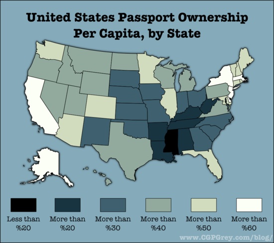
Next, let's look at the frequency of citizens who hold
passports in the different states (darker color = fewer passports):
 How about Education
? Here's one showing the fraction of population age 25+ who holds a bachelor's degree (darker = higher):

Got that? Let's move along to religion, and the distribution of
evangelicals:

Nan Hunter, writing at the blog
Hunter of Justice looks at the map of the US from the point of view of LGBT rights.The states that have any recognition for LGBT people , such as antidiscrimination laws, and/or partnership/marriage protections, are left white. (However, many of the white states are explicitly anti-marriage so it's a pretty low bar.) The remaining states are blue (for Democratic legislature and governor), red (for Republican) and purple (for mixed). Unsurprisingly, the white states are largely blue or purple.

And here is an over-optimistic estimate of when marriage equality laws will happen in different states, based on data about the polling opinions there (For example, data like
this. Map From
Mapscroll)

What about economic activity? Here's the
per capita GDP by state:

And here's one that shows us
who gets the federal money. Values <$1.00 are states that get less from the Fed than they pay in taxes; values >$1.00 are states that get more than they pay.

Finally, this week is the 150th anniversary of the start of the
Civil War.

Discuss.


