Female mortality rates increased in 42.8% of counties (male mortality rates increased in only 3.4%).
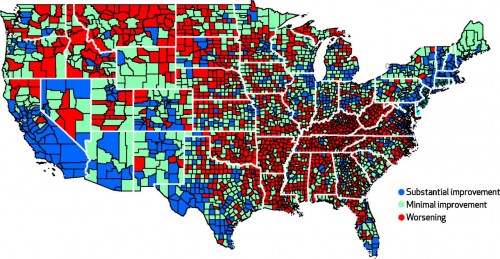
Now, if you go to my other maps posts, you will see that the regions with increased mortality for women are also the regions with
- above-average religiosity, particularly Evangelical
- lowest economic activity (GDP)
- fewest passports
- slowest to overturn anti-miscegenation laws
- least gay friendly
So it looks like the income-gap and regional economic gaps and culture gaps also exacerbate the gaps between men and women's health.
Discuss.
1 comment:
Discuss?
I think we're in "Shockingly Predictable" territory.
Post a Comment